What makes you click on a YouTube video?
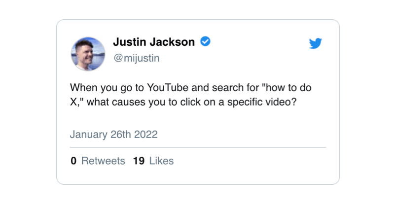
When you go to YouTube and search for "how to do X," what causes you to click on a specific video?
I've been trying to improve Transistor's YouTube channel.
As an indie business, creating videos seems to be a good search optimization strategy. We're trying to rank for terms like "how to start a podcast," and a well-made video can show up in search results (both on Google and YouTube).
What makes someone click on a video?
When I posed this question on Twitter, the responses were incredibly helpful.
In general, the factors that seem to cause someone to click on a YouTube video are:
- Thumbnail
- View count
- Video length
- Title & description
- How old the video is
- First 5 seconds of the video
This past week I've been making a new video for Transistor, and I decided to put some extra work into optimizing the way it shows up in search results.
Here's what I've learned (and tried) so far.
Optimizing the first five seconds
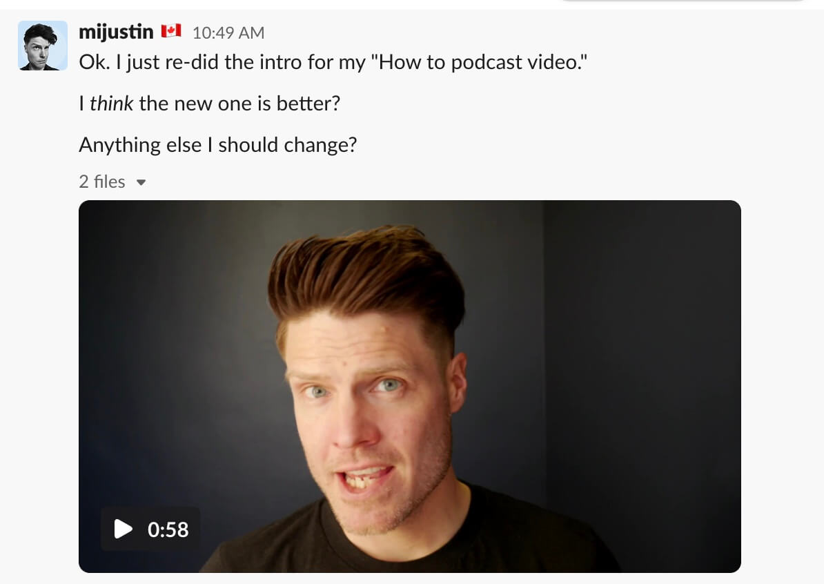
After looking at competing videos on YouTube, I realized how important the first five seconds of the video are. YouTube has started giving folks a short animated preview of what they can expect. Plus, once someone clicks a video, those first few seconds determine if they stay and watch, or bounce.
I re-edited my intro a few times, adding background music, a title screen, and preview scenes to give folks a sense of what to expect later in the video. I asked the MegaMaker Slack for their feedback:
Getting feedback like this, during the creative process, was really helpful as it pushed me to keep making the video better.
Optimizing the thumbnail
As I was finishing the editing, I started looking at optimizing the thumbnail.
My kids frequently remind me that I am "old and cringe," so I knew this was going to take some work.
My first attempt at thumbnails were not great:
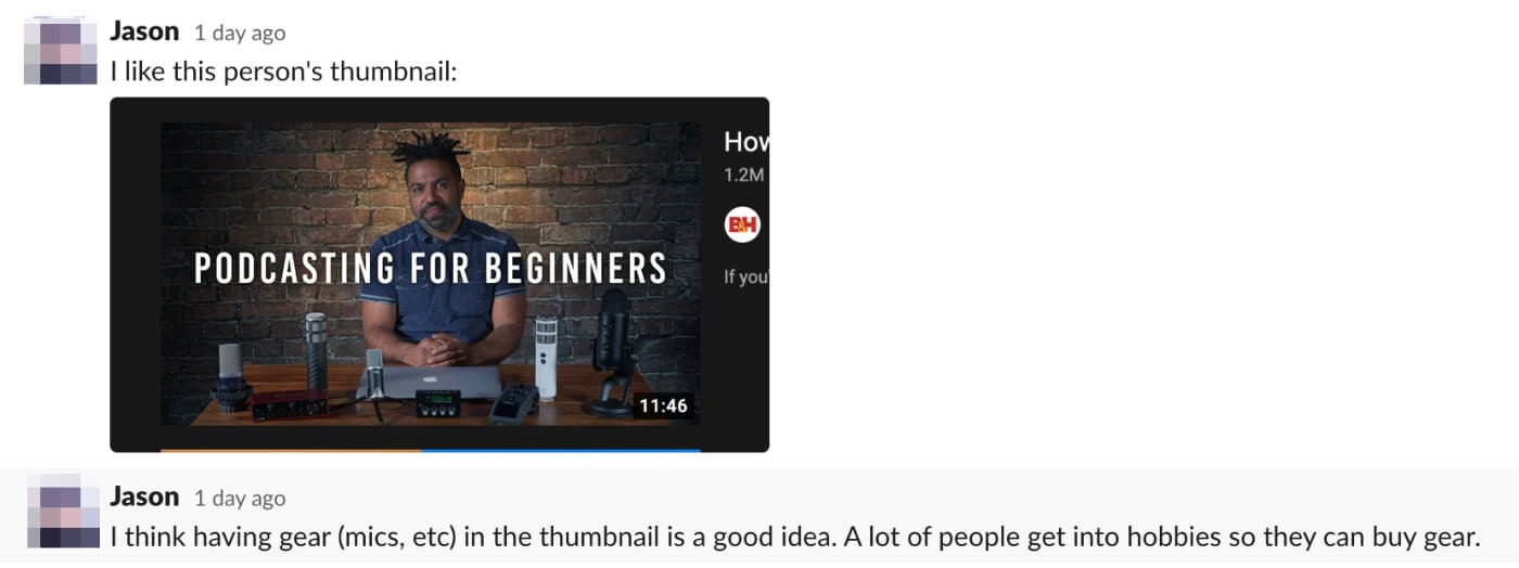
Some people recommended I take a new photo for the thumbnail. We noticed that photos that featured recording gear seemed to rank higher:
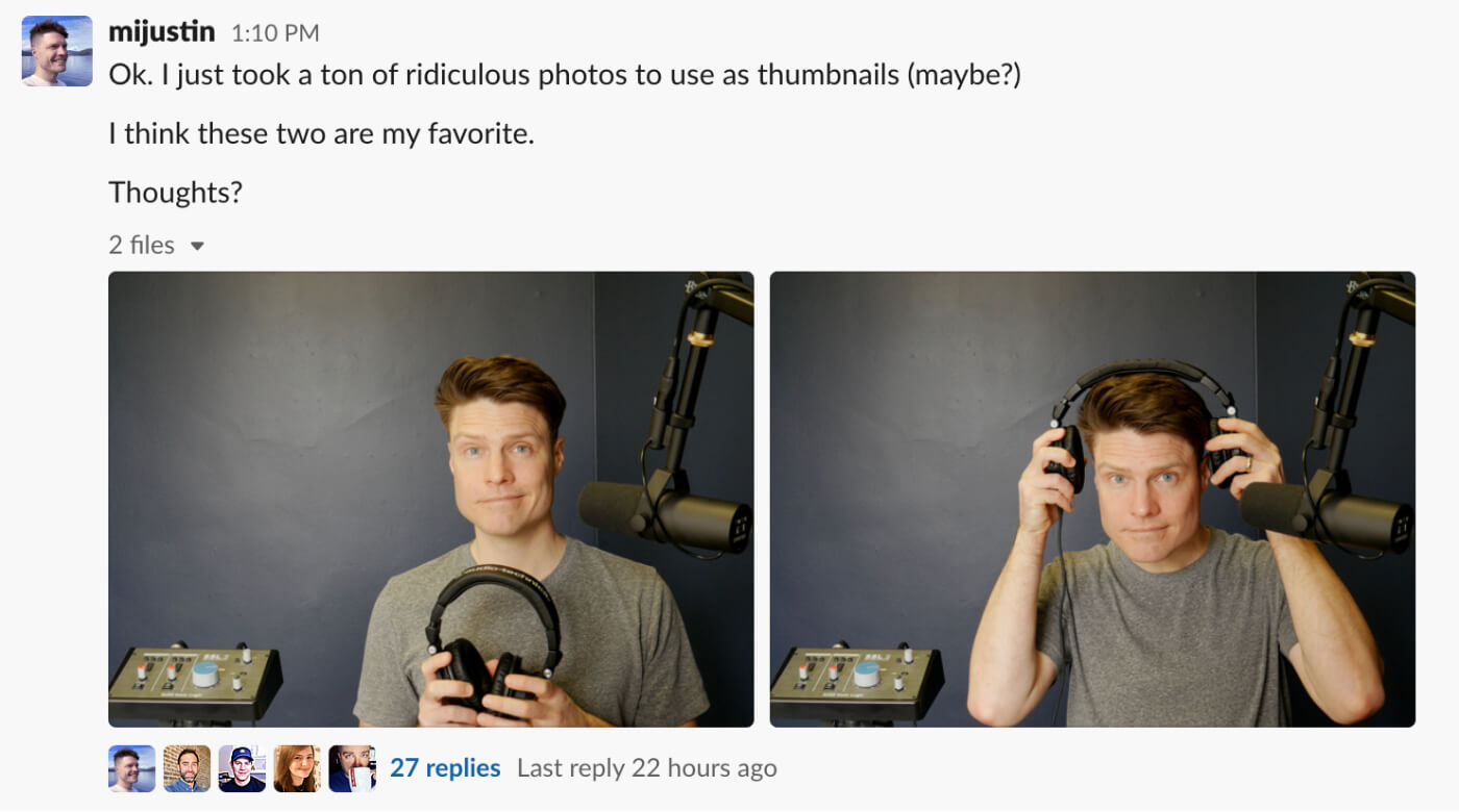
I spent most of yesterday trying to take new photos. Most of these are, as my kids say, "pretty cringe" but you can see every shot here.
In the Transistor Slack, I ended up highlighting these two photos. The team preferred the second one.
I brought these photos to Twitter, and asked for more feedback. The most helpful was from Lenny, who took my original idea, and improved it substantially.
Lenny recommended we zoom in on me, and create multi-color titles to make the video stand out.
He even thought I should zoom in more and crop out the microphone on the right: "Having too many things going (ie. person + the mic) makes it perform less than just having one focus."
Testing thumbnails (split testing)
In the past, I've used UsabilityHub for running first click tests. I mocked up a YouTube search results page and created two variations:
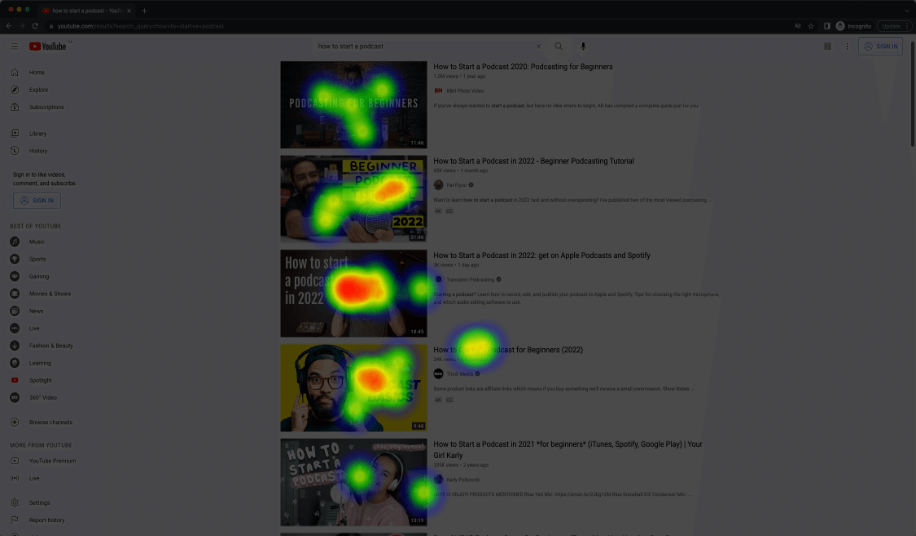
I got UsabilityHub to recruit 25 testers for each variation. It didn't take long to get results! Here's a heatmap report they provided:
In this test, when compared to top YouTube search results, my thumbnail was getting a fair number of clicks.
At the very least, this test showed me that my thumbnail was "good enough."
Optimizing the description
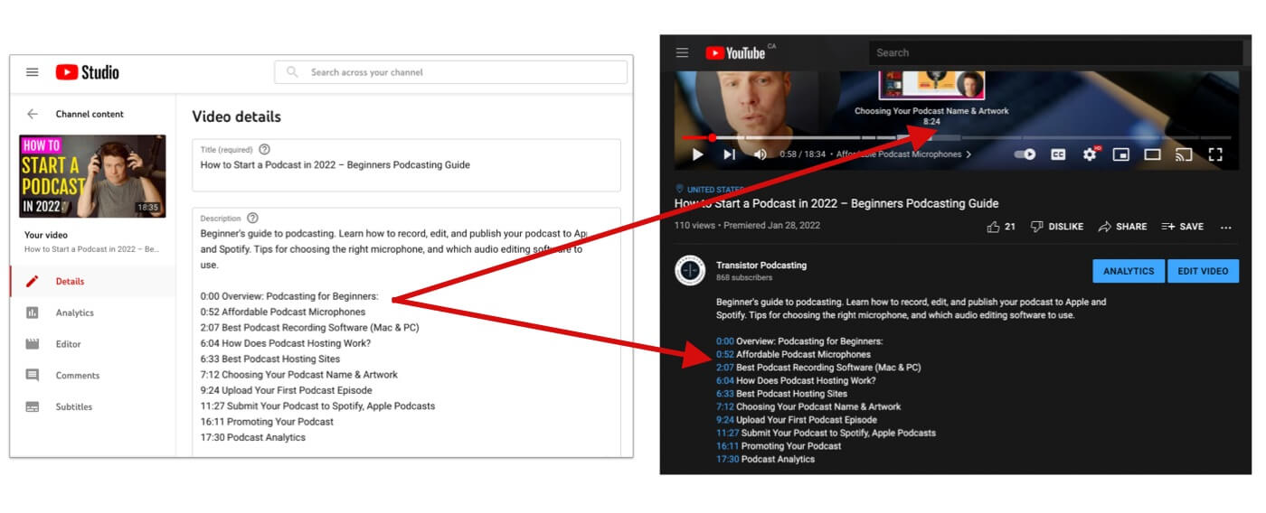
I got a useful tip from Rachel, who said that "longer videos with chapters generally perform better."
You can add chapters to any YouTube video by typing out timecodes in the video description:
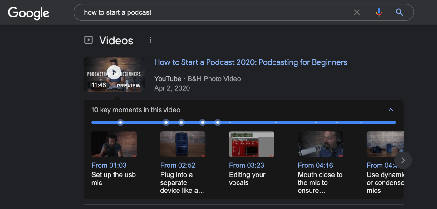
These timecodes show up when watching the video on YouTube, but Google also seems more likely to feature these videos in search results:
The final result
Here's the final version of the video I published:
Promoting the video
My next goal is to get more views on the video. Here's what I've done so far:
- Created a new YouTube playlist
- Posted it on a few Slack groups
- Embedded it on our blog
- Shared on Instagram
- Posted it on Twitter
If you have any tricks for optimizing videos for search, I'd love to hear them!
(Also: if you watch the video that'd mean a lot to me!)
I hope this case study was helpful for you. 👍
Cheers,
Justin Jackson
@mijustin
