The vague headline
Increasingly, I see established brands using vague headlines on their homepage. These were famously parodied by Tiff Zhang's hilarious startup homepage generator.
If you look at Buffer, Intercom, or MailChimp's websites, they've all opted for this more general positioning.
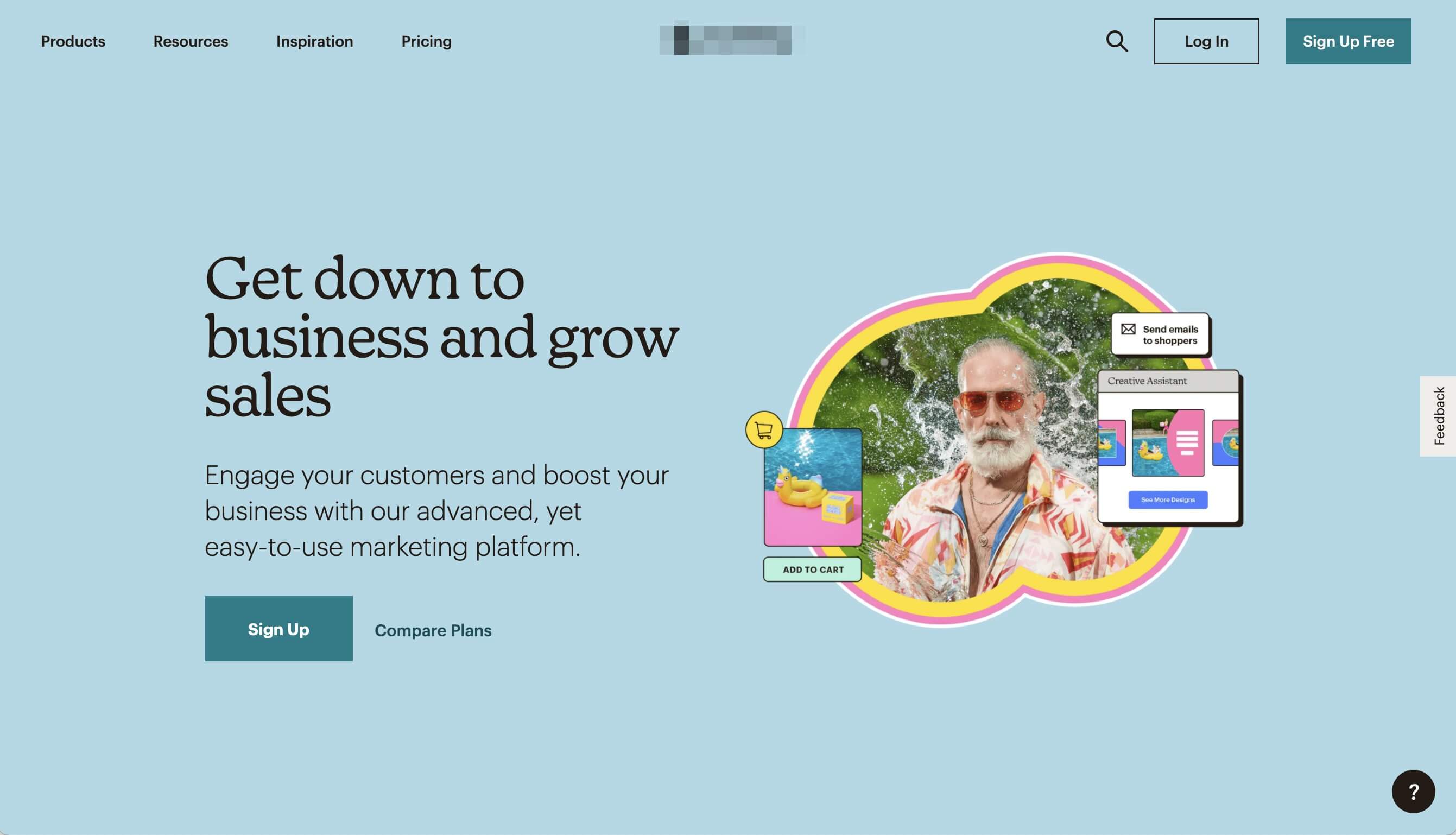
For me, this approach is perplexing. When I visit websites with a headline like "Get down to business and grow sales," I have no context for what their software actually does. "I need email newsletter software, but this looks like... shopping cart software? What's a 'marketing platform'? Wait... it says 'grow sales,' so maybe it's a CRM?"
"This explains why I often can't tell what companies do from looking at their site."
– Dax Raad
I suppose these established brand can experiment like this because most customers already associate them with a particular category (Mailchimp = email marketing).
But, I'm not convinced that vague headlines like this work at all. Again, what does this product actually do?
One thing is for sure: this isn't an approach that new indie brands should be trying.
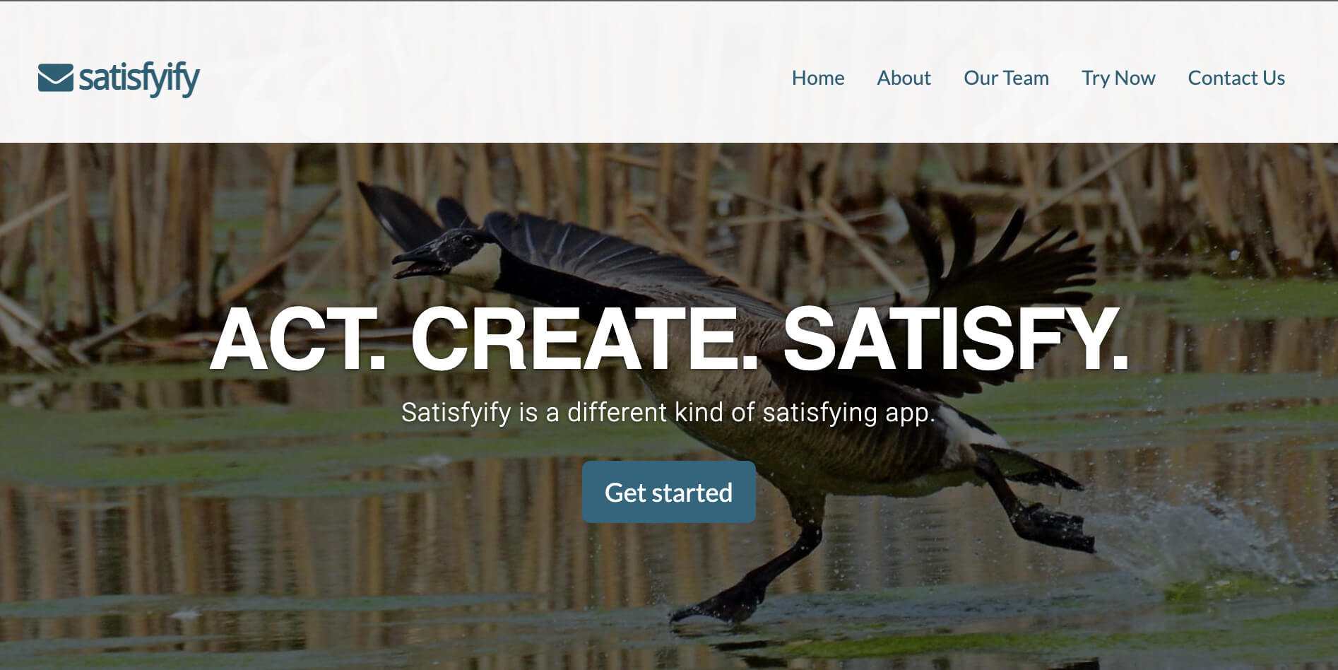
Instead, new indie SaaS products should explicitly describe what their software does in their headlines:
- "Reform – Clean forms. On brand."
- "SavvyCal – A scheduling tool both you and your recipients will love."
- "Transistor.fm – Your podcast's publishing platform."
As a new brand, the whole point of a headline (IMO) is to quickly tell people what you're selling!
People are searching for X. As a new company, you still don't have brand awareness. So if you're lucky enough to get someone visiting your site for X, quickly let them know they're in the right place! Don't waste your opportunity trying to sound clever.
Now, of course, a great headline won't matter if there isn't already demand for what you're selling. A headline just lets customers know: "We've got what you've been searching for."
To me, an "effective" homepage should be consistently producing signups.
People should be coming from google searches, word-of-mouth recommendations, review sites. When they land on your site, it should quickly let them know that they're in the right place. And then, they should be signing up for a trial.
Your visitor-to-trial conversion should be around:
- 0.75% - 1% (credit card upfront)
- 5%+ (no credit card)
I don't believe vague headlines, value-props, and sentiment-based "benefit-driven" work, but don't take my word for it; test your own assumptions!
In the past, I’ve used Usability Hub to run these kinds of tests:
- the 5 second test (what do people remember after seeing a page for 5 seconds?)
- first click test (what do people click first?)
In this Twitter thread, when founders posted their website, many respondents couldn't tell what their company actually did.
Edward Shepard shared that his company (Tiller) created dozens of "unique value proposition" headlines. But when they tested those fancy headlines against a simple, descriptive one, this simple descriptive headline won every time: "Your financial life in a spreadsheet, automatically."
Hope this helps!
Justin Jackson
@mijustin