Landing page teardown: Serial podcast
I haven't listened to the new Serial podcast yet.
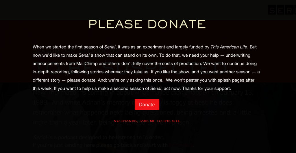
But I am interested in landing pages, and their current splash page caught my attention:
The producers of Serial have made a classic copywriting mistake here: they've forgotten that when you're trying to persuade someone, it can't be about us, it has to be about them.
Read it again, and look at the self-focused language:
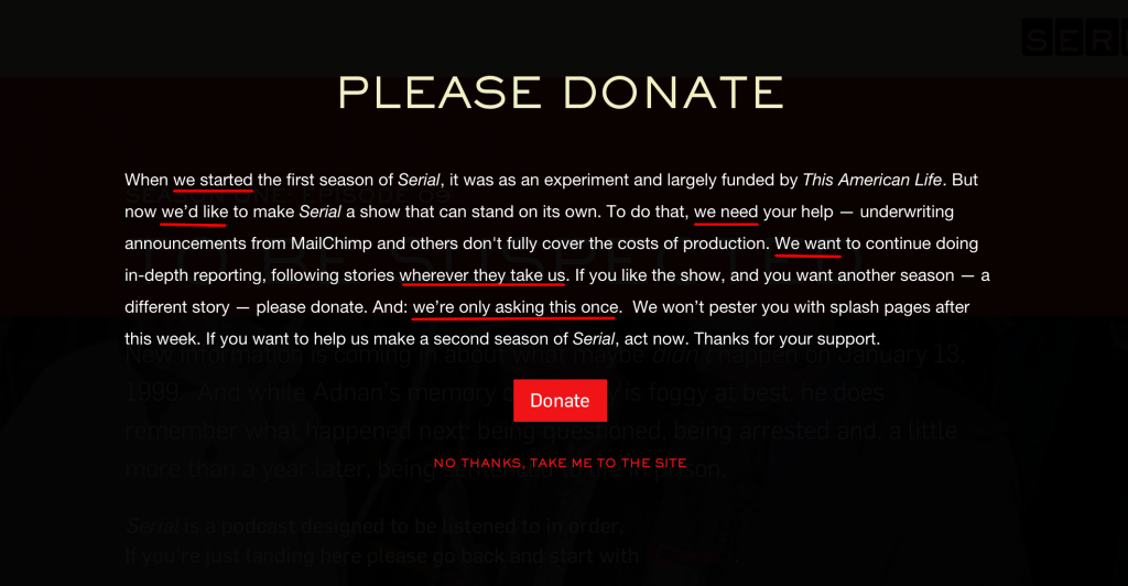
"When we started..."
"We need..."
"We want..."
This page doesn't even mention the listener until the 5th sentence, and it's the listener who should be the star of this narrative.
I'm going to paraphrase Dale Carnegie here loosely:
"People don't care about what you want. They only care about what they want."
And to paraphrase my friend Brennan Dunn:
"People buy the outcomes that they want."
This means that writing has to be focused on the reader. The story we weave can't be about us; the central character of the story needs to be them.
With this in mind, I quickly re-wrote the Serial landing page here:
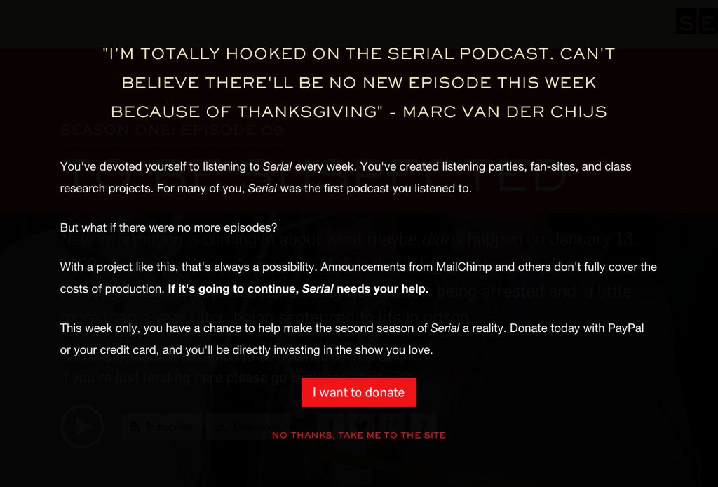
This copy focuses on two characteristics of the Serial audience:
- They are addicted to this show. The worst thing for them is when there isn't another episode to listen to.
- They feel personally invested in the show: they feel ownership over it. They've started listening parties, fan-clubs, and class research projects around Serial. They feel like it's their show.
Based on those two themes, here are my recommendations for the Serial landing page:
- Open the landing page with this quote by Twitter user @chijs. This sets up the central theme: "What if there were no more episodes?"
- Invite the listener to be a part of the solution: show them that they can affect the future of the show they love.
- Create some urgency, using phrases like "This week only."
- Make the call to action personal. I would start by trying "I want to help" on the main button.
Update
After some great ideas from people on Twitter, I've created an updated revision of the landing page:
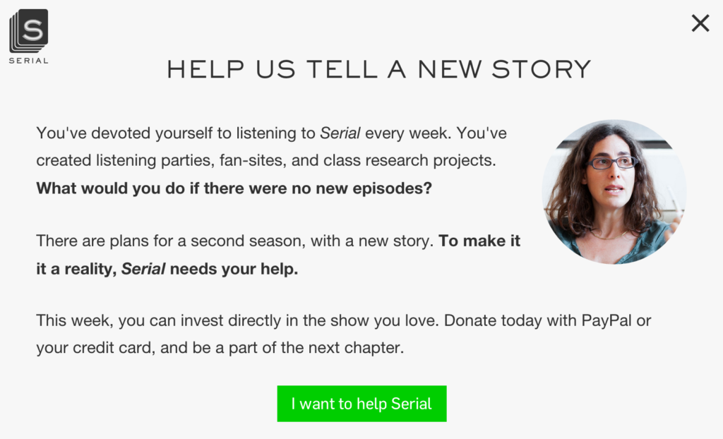
Here's what we changed:
- Softened the background (Mark Bunnker mentioned it looked like a warning screen)
- Added a Serial logo (suggested by James Love) and a photo of Sarah Koenig to humanize it (as suggested by Shen DeShayne)
- Nathan Barry came up with a great new headline: "Help us tell a new story"
- There were many suggestions for a new CTA, I decided to incorporate Steve Purcell's.
- Did more copyediting: trimmed out text to make it more concise, and emphasized that listener investment will help get a second season of Serial.
Naturally, these assumptions would need to be tested. If the producers of Serial want to contact me, I'd be happy to set-up an A/B test on their site. ;)
What do you think? Reach out to me on Twitter.
Update #2
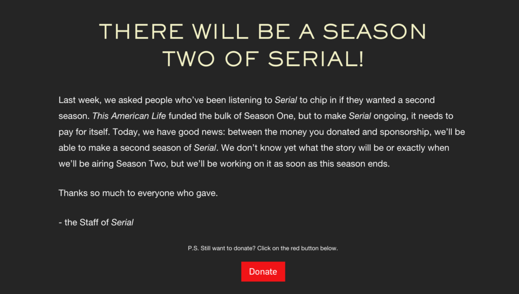
Looks like Serial raised enough money (with their original landing page) to fund a second season. ;)
Cheers,
Justin Jackson
@mijustin
PS: Here are some of the suggestions I'm getting on Twitter.
https://twitter.com/patio11/status/536897073501593600
https://twitter.com/CasJam/status/536896081108688896
https://twitter.com/nathanbarry/status/536930868275974145
https://twitter.com/SachaGreif/status/537041053635710977
